In the spring of 1970, more than 20 million Americans poured into the streets for the first Earth Day. It was a tidal wave of collective energy that reshaped policy, created the EPA, and ignited a global conversation around the environment. Fifty-five years later, we find ourselves at another inflection point. The science is irrefutable, the technology is here, and the clock is ticking. What the climate movement needs now isn’t invention — it’s momentum.
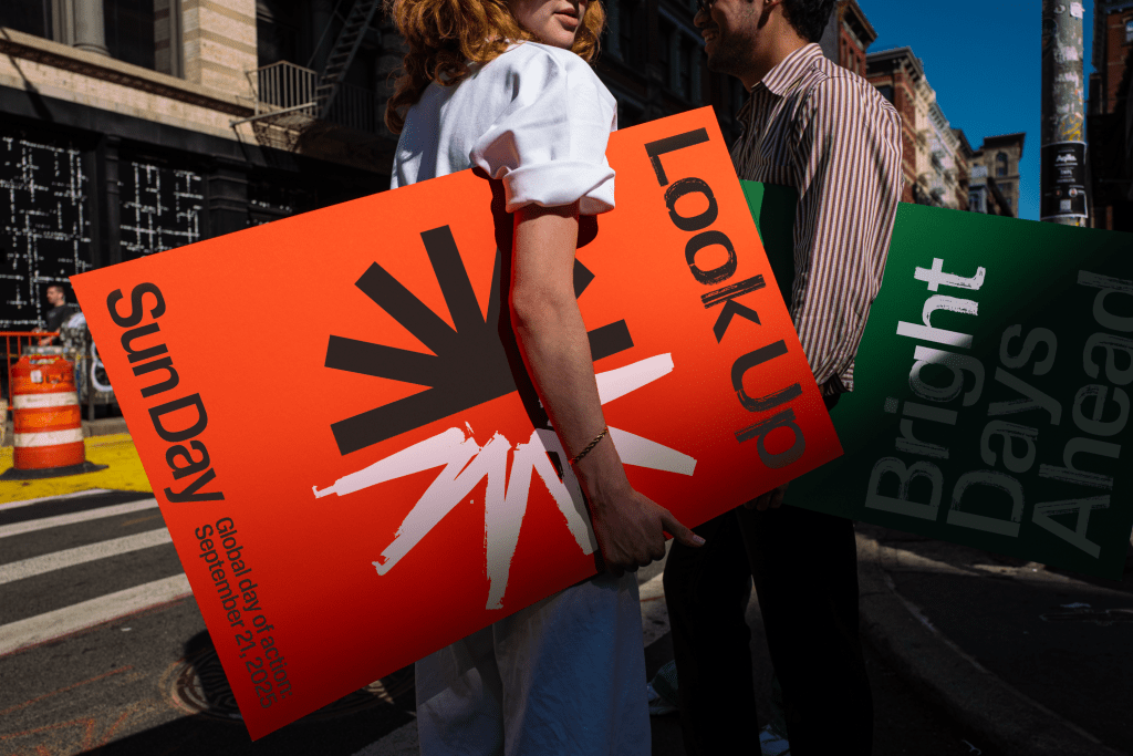
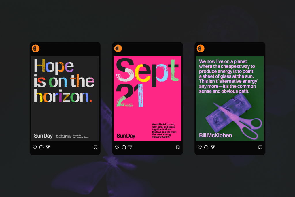
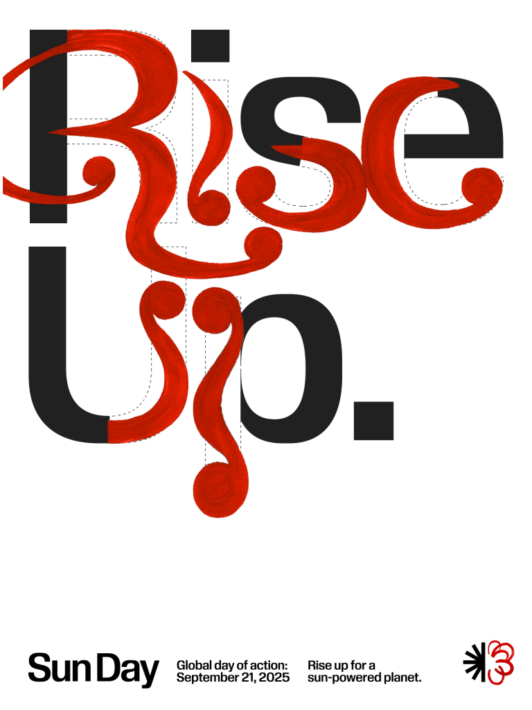
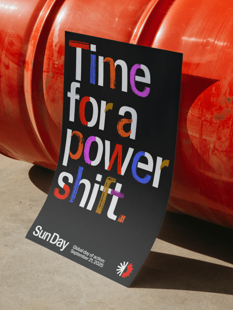
Enter Sun Day, a new global day of action launching today, September 21. Conceived by Bill McKibben and Denis Hayes, the founder of Earth Day, and designed with COLLINS, the movement is less about what’s missing in the fight for clean energy and more about how design can help complete the circle. Quite literally.
Before we had the design system, logo and identity for Sun Day, it was just an idea. After, it became the seeds of a movement.
Bill McKibben
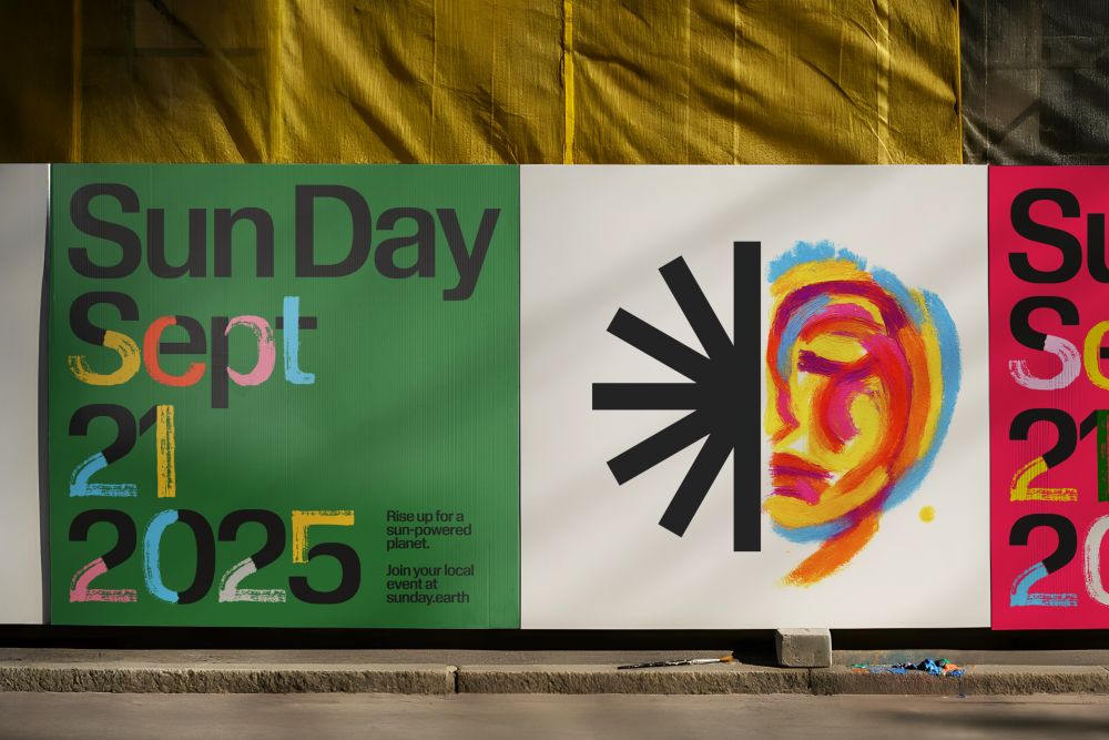
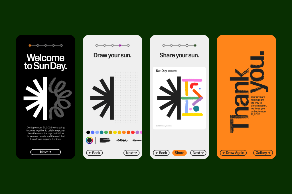
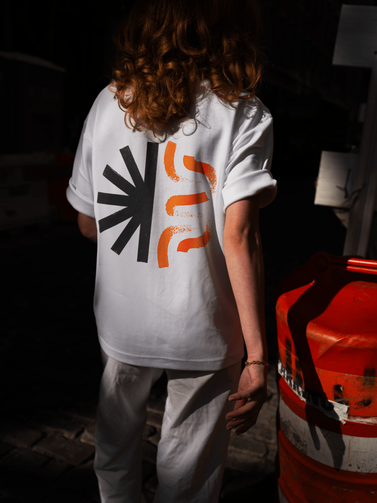
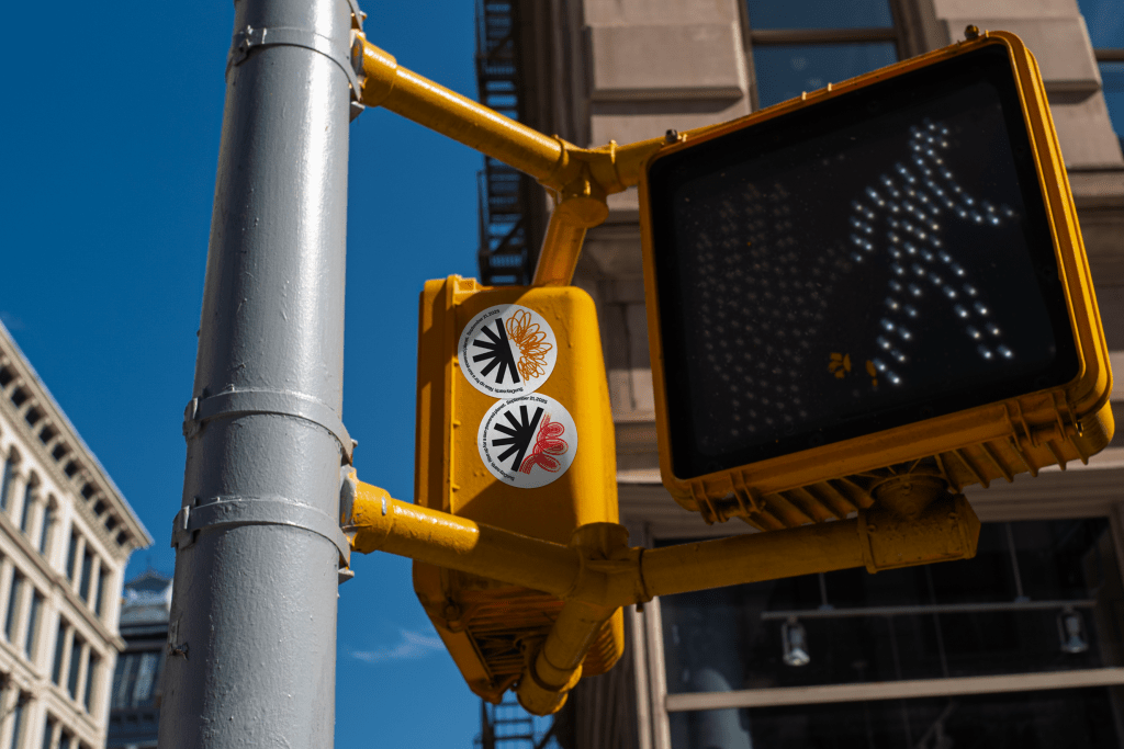
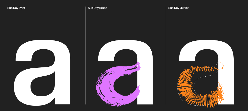
That idea — anchored by a half-drawn sun waiting for each of us to finish — captures the genius of the approach. COLLINS’ bold yet flexible identity system transforms environmentalism from an abstract political project into a participatory act of authorship. The design solution is radical in its simplicity: a sun that is never complete until someone decides to make it so. It is paired with a digital commons, where anyone from Tulsa to Tahiti can draw their own sun, place it in a global gallery, and instantly see themselves as part of a collective. And it is amplified through a living typeface, one built to echo the handmade urgency of protest posters, designed to be remixed, redrawn, and claimed by the people it serves. These design assets turn a symbol into a living, participatory movement.
For me, this story isn’t abstract. I grew up with a father who pointed out receding glaciers on family trips through the Canadian Rockies and taught us the importance of caring for nature. I remember the first time I saw the haze of wildfire smoke settle over my hometown, an eerie reminder that the future we’d been warned about had arrived. As a designer, I’ve always believed in the power of visuals to ignite imagination. And as someone personally invested in clean energy and better futures, I’ve come to see design as one of the most underutilized tools in the climate fight. We often think about environmentalism as a matter of policy or protest, but movements live and die on whether they can connect people to possibility. Design makes that connection tangible. It makes an issue feel personal, urgent, and, crucially, participatory.
To better understand how this intersection of design and activism played out in real time, I spoke with the team at COLLINS about their process.
Sun Day lives as much online as it does in the streets, through the digital commons, the living typeface, and a global gallery of hand-drawn suns. What did you learn about designing for movements in a digital-first world, where cohesion has to coexist with grassroots chaos?
Eron Lutterman, Director/Partnerships & Audiences, COLLINS:
You’re exactly right. From the beginning, we knew Sun Day had to live as comfortably in the digital commons, social feeds and group messages as it did on wheat-pasted walls, protest banners, or classroom hallways.
One couldn’t be more important than the other.
Working with our friends at Garden3D, we realized that the very best digital experiences don’t invent behavior; they mirror what we already instinctively know: pressing a button, dragging a folder, highlighting a line, drawing with a crayon. To create a digital movement, we didn’t need a brand new wheel. We just made half of one—the half-sun—that carried the ritual of protest poster–making into its future and into the digital space.
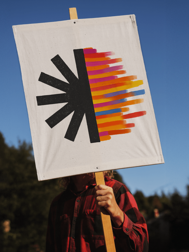
That tension between a strong, grounding form and the chaos of grassroots improvisation was always the heart of our idea. The messy brushy fonts, the hand-drawn outlines, the bluntness, the “wrong” things are deliberate. We kept the edges loose and rough so everyone, anyone, felt welcome. Virality here was critical, and it wasn’t going to come from corporate ad buys; it had to come from people seeing themselves in the mark and carrying it across borders on their own terms.
In our first workshop in Pescadero, Bill McKibben gathered a remarkable coalition: First Nations leaders, international NGOs, solar CEOs, and young activists. It took one look around that room to be immediately clear that our thinking had to flex enough to give everyone an invitation to make the movement their own. That principle has also guided COLLINS for a long time: we build design systems people can design from, not design to. Systems should expand people’s imaginations, not constrict them.
And finally, we wanted to design a ritual. The moment you submit your drawing, you can see yourself reflected in a global gallery of suns. That small act of completion gives people a tangible way to say: I stand with everyone else here who believes the time to act for smarter sources of energy is now.
The half-drawn sun is radical in its simplicity. But simplicity is often the hardest thing to achieve in design. Can you walk us through the moment you knew this idea wasn’t just clever, but powerful enough to unify millions across cultures, languages, and platforms?
Beth Johnson, Senior Designer, COLLINS:
Designing a campaign for climate action, something the whole world could rally behind, was a delightfully critical challenge. Our criteria were clear: it had to be simple enough for anyone to draw, universal enough to be understood across cultures and languages, and iconic enough to fly on a flag.
We studied grassroots symbols that have endured: the peace sign of the 1950s nuclear disarmament movement, the rainbow pride flag by Gilbert Baker, and the Extinction Rebellion hourglass. Each represents vastly different human hopes, yet all share a common language: simple geometry, familiar shapes, and nothing over-designed. An unembellished form that people can easily claim as their own.
After endless concept sketching, we reduced the idea to its essence: five bold rays, forming only half a sun. The other half is left wide open for people to complete themselves. Because movements thrive when people see themselves in them, when they’re invited to participate—to help carry the cause forward.
That’s how we arrived at our half-sun symbol. As Bill McKibben said about the viability of sun power, “we are halfway there, halfway to go.” The tools to solve the energy problem are already in our hands: what’s missing is the collective momentum to build with them. This symbol stands for both the progress we’ve made and the work we all must still finish, together.
Earth Day’s visual identity in 1970 was almost accidental — posters, buttons, and Xeroxed leaflets. Sun Day, on the other hand, was designed with intention from the very start. How did you approach creating an identity that isn’t just symbolic, but actively participatory, something that literally requires people to finish it?
Brian Collins, Co-Founder, COLLINS:
First? Get invited to work with visionary leaders like Bill McKibben and Dennis Hayes. Then work with our talented colleagues here at COLLINS, including Beth Johnson, Eron Lutterman, Mason Lin and Rohan Rege. Then you call our gifted friends at Commercial Type and Garden3D. It all happened because of them.
Perfection is the enemy of participation. If you hand people something that’s too polished, too resolved, you proclaim: This is finished. Do not touch. Admire from a distance.
That’s not designing. That’s policing.
Real cultural movements do not behave like well-behaved, polished, corporate conferences. They’re loud, chaotic, and usually a little embarrassing—like democracy itself. And the messy artifacts of those movements, the urgent, handmade signs, big painted symbols on white bed sheets, cut-up leaflets, all carry the glorious evidence of human fallibility: mistakes, smudges, rips. That’s what makes them real. That’s what makes them sincere.
We don’t confuse dull, lockstep consistency with credibility.
So, we’ve tried to flip that kind of dreary, old-school, well-behaved brand identity design on its head. To embrace an idea that expects glitches, welcomes them, even depends on them. You don’t police the crooked lettering—you provide the crooked lettering’s stage. You don’t hide the fact that people will scrawl in the margins—you make the margins wide enough to scrawl in.
In short: the most powerful design for a movement isn’t the one that hides its weird, messy humanity under a veneer of perfected, professionalized gloss. It’s the one that hands people the marker and dares them to make it worse. Because worse, as it turns out, is way better.
Worse is alive. Worse is passionate. Worse is participation. Worse is real.
And everyone here is working to make the big goal of Sun Day real.
Years ago, a writer once asked me for my definition of design. My answer was—and still is—this: Design is hope made visible.
Today, that hope is half a symbol for Sun Day. The other half is in your hands.
What makes Sun Day feel vital isn’t only the urgency of climate change, but also the design choices that transform urgency into unity. A half-drawn sun may seem simple, but it carries a powerful truth: no movement is complete without us. Just as Earth Day turned millions into environmental advocates overnight, Sun Day offers a chance to reimagine how design can amplify, invite, and sustain collective action. And if the climate movement is truly at a tipping point, perhaps the most radical thing we can do is not just raise our voices, but redesign the way we rally.
COLLINS team: Beth Johnson, Eron Lutterman, Mason Lin, Rohan Rege
The post Designing Action: COLLINS, McKibben, and the Birth of Sun Day appeared first on PRINT Magazine.